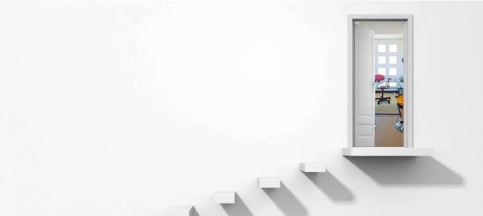
Branding
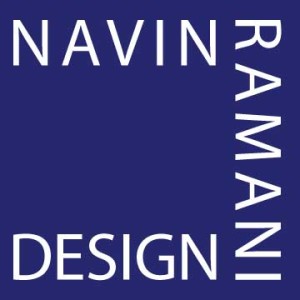
Logo refinement for an interior designer with a love of squares
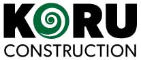
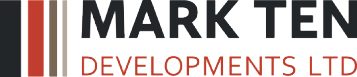
Fine tuning of the koru (unfolding fern) in the logo as well as font choice for a development company.
Logo for development company specializing in residential, industrial and commercial construction.

The logo was to sit on a black leather background, so the logo was designed to have a chrome look on the leather for contrast.
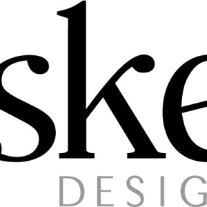
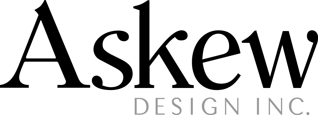
Company logo utilizing a blend of two typefaces to give a balanced look to Askew. This was based on the love of the font's A.