Why Not Using a Graphic Designer is Like “The Emperor’s New Clothes”

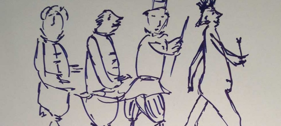
Winning draw-off sketch for “The Emperor’s New Clothes”
Preface: In this modern design version of The Emperor’s New Clothes you are the tailors AND the Emperor.
Let’s face it, you started your business for a reason. You had an idea, and perhaps even a plan. You were going to do X better, or at least as well as anyone else out there.You thought about it, you came up with a name, and you opened your ‘doors’.
In the process of starting up, you knew (because everyone told you) you needed a website, you needed a logo for your business and you needed some business cards. Before even talking to any designers you determined you couldn’t afford their services. It would be too expensive and you are just starting out. Plus you could do it yourself. You have Word and Powerpoint and any number of hosting services offer you the opportunity to choose from a few set templates. No problem.
So you pick the colours you like and you figure the more the merrier. You use whatever fonts are standard and already set by the programs because you don’t know how to change them. Or if you can easily change them, you make as many choices as possible with what you like. You refuse to admit you don’t understand the marketing implications of your choices. Heck, any idiot can change the font and the colour on something, who needs a designer for that? And really, what difference does it make anyway?
Now your company image is presented to the world. You parade it around town with every business card you hand out and everything you provide that has your company logo or website on it. You are out there. Exposed.
You’re the new Emperor in town.
How a bit of knowledge about design and marketing could have helped:
- A consistent message in everything you do is of key importance. Using an old, stuffy font for a young, hip brand is sending the wrong message. Having your website, business cards and logo all giving a different message is the wrong message. Being all over the map with what you’re trying to say visually will make you appear unprofessional. Everything should be selling your brand. This includes all the images you place on your website, both in terms of colour and content.
- Small subconscious psychological details make a difference. Whether you like it or not, colour and font choices give more visual cues than you might imagine. Are yours providing the right ones to your target market? Do they align with your company’s image and personality? Again, consistency is key.
- Less is more. More breathing room around text. Fewer fonts and fewer colours. Only the essential information to get your point across. Just because there are so many choices and so much room on the page, or business card, doesn’t mean you have to use it all.
We could go on and on.
Just know that there are good designers out there for various budgets, whether you are a start-up or an established company. There are many ways a designer can ensure you are fully covered when you head out into the world. It’s worth having a conversation because we’re here to present what you’re trying to say about your business…visually.